Designer-Favorite Warm Whites (Great for Walls, Trim, Cabinets, Whole-Home Palettes)
When homeowners begin planning an interior design refresh, the question that comes up more than any other is simple: “What is the best warm white paint color?” Warm whites are foundational in modern home design, especially if you love a soft, inviting, organic-modern aesthetic or rely on virtual interior design guidance to create a cohesive look across multiple rooms.
Below are some of the most designer-recommended warm white paint colors—favorites known for their subtle undertones, versatility, and effortless ability to work beautifully in different lighting conditions. Each of these warm whites is a high-performing option for walls, trim, cabinetry, and whole-home color palettes.
Sherwin-Williams Warm Whites
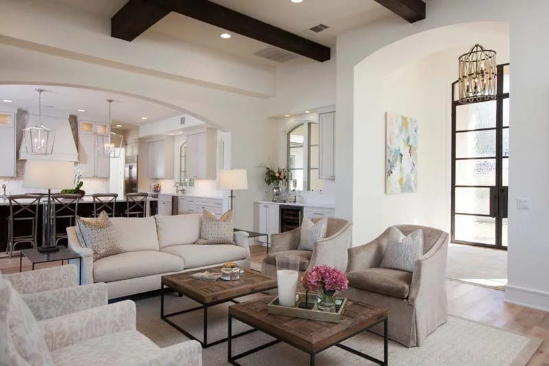
Alabaster (SW 7008)
Designers continually return to Alabaster because of its balanced warmth—never too yellow, never too stark. It offers that “just right” cozy softness that feels timeless, making it a leading choice for walls, trim, and cabinets. Alabaster is often called a “go-to neutral” for good reason: it adapts extremely well to both modern and traditional interiors.
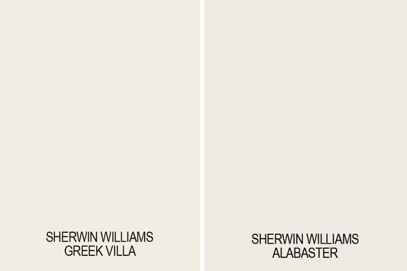
Greek Villa (SW 7551)
Greek Villa is a clean warm white that feels slightly brighter than Alabaster, giving it a fresh, airy quality ideal for organic modern spaces. Designers choose it when they need a warm white that maintains clarity without becoming cool or sterile. It’s excellent for creating a cohesive backdrop across open-concept homes.
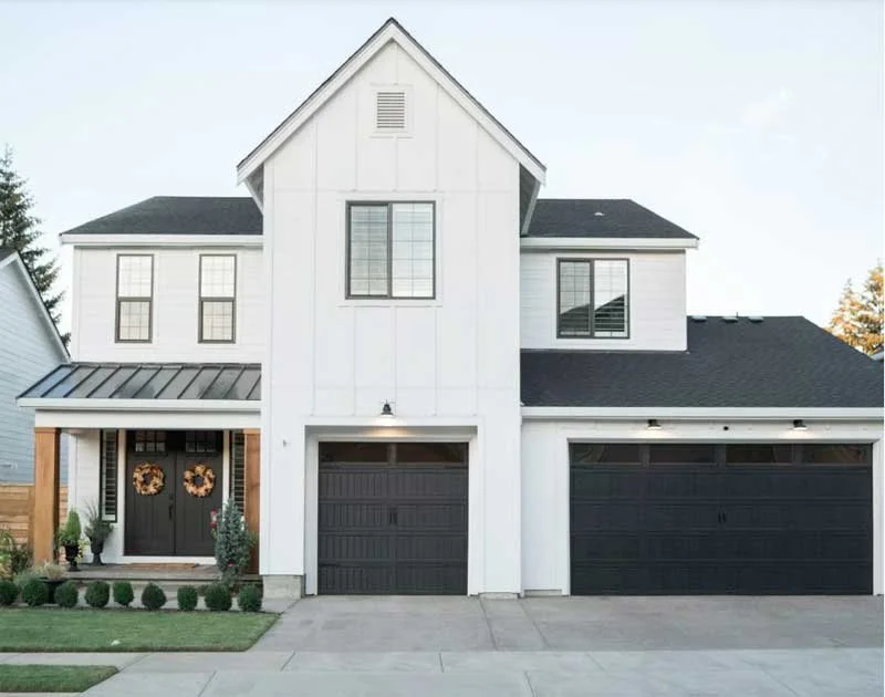
Pure White (SW 7005)
Despite its name, Pure White has a whisper of warmth that keeps it from feeling cold. It’s one of Sherwin-Williams’ most flexible whites, especially suited for homeowners who want a soft, natural, non-harsh white. Its subtle warmth and lighter appearance make it a beautiful choice for kitchens, bathrooms, or anywhere you need clean brightness with gentle warmth.
Benjamin Moore Warm Whites
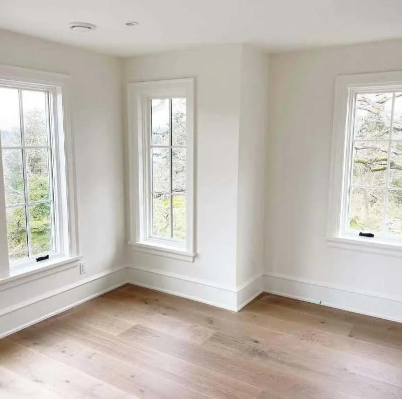
White Dove (OC-17)
Among interior designers, White Dove ranks as one of the most beloved warm whites in the entire industry. Its creamy but refined tone works across walls, trim, cabinetry, and entire home palettes, striking an ideal balance between warmth and brightness. White Dove creates a comfortable, welcoming atmosphere without sacrificing sophistication.
Swiss Coffee (OC-45)
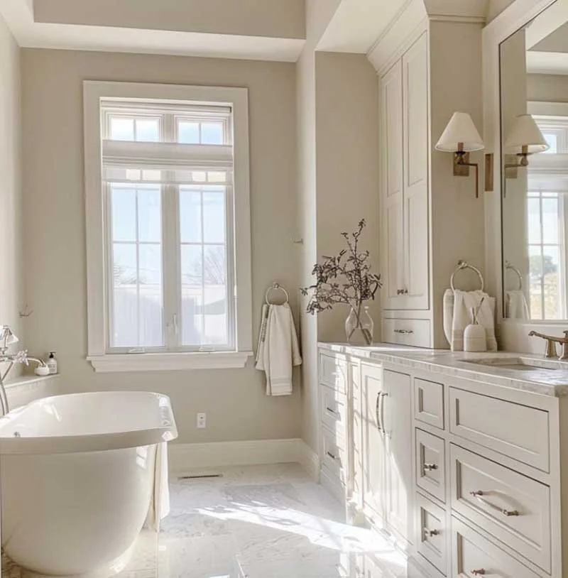
Swiss Coffee is a slightly creamier off-white with a cozy undertone that never feels heavy. Designers often choose it for clients who want spaces to feel timeless, inviting, and soft—rather than stark or overly bright. Swiss Coffee pairs beautifully with organic textures, natural materials, wood furniture, brass finishes, and earthy décor.
White Dove (OC-17)
Among interior designers, White Dove ranks as one of the most beloved warm whites in the entire industry. Its creamy but refined tone works across walls, trim, cabinetry, and entire home palettes, striking an ideal balance between warmth and brightness. White Dove creates a comfortable, welcoming atmosphere without sacrificing sophistication.
Swiss Coffee (OC-45)
Swiss Coffee is a slightly creamier off-white with a cozy undertone that never feels heavy. Designers often choose it for clients who want spaces to feel timeless, inviting, and soft—rather than stark or overly bright. Swiss Coffee pairs beautifully with organic textures, natural materials, wood furniture, brass finishes, and earthy décor.
Why Designers Swear by These “Safe Warm Whites”
Warm whites are notoriously tricky because undertones vary dramatically depending on light exposure and surrounding finishes. The warm whites above are considered reliable “designer favorites” because they consistently perform across real homes, real lighting, and real materials.
Balanced Undertones
These paint colors avoid heavy yellow or green undertones. Instead, they lean softly toward cream, greige, or beige—making them flexible enough for modern, transitional, farmhouse, and organic-modern interiors.
Consistency Across Lighting Conditions
These warm whites stay calm and neutral in north, south, east, and west-facing rooms, making them ideal for whole-home color palettes or virtual interior design plans where multiple lighting environments must be considered.
The Perfect Base Canvas
Because these shades are subtle and balanced, they don’t fight with flooring, stone, tile, wood tones, or architectural details. They serve as the perfect backdrop for layered textures, organic materials, warm wood furniture, and modern finishes.
Timeless and Adaptable
Warm whites in this range age gracefully, even as décor trends evolve. They offer long-term value, eliminating the need for frequent repainting due to trend shifts.
Great for Rooms with Shifting Daylight
If your home experiences dramatically different light throughout the day, Alabaster and White Dove are excellent choices because of their ability to remain consistent under both natural and artificial lighting.
Key Considerations When Choosing the Right Warm White
Even though these warm whites are designer-approved, choosing the best one for your home still requires thoughtful testing. Warm whites are sensitive to changes in lighting, texture, and surrounding materials.
Always Test Paint Swatches
Paint your samples directly on the wall—not on a loose card—and view them throughout the day. Warm whites can shift significantly from morning to evening light.
Compare with a Pure White Sample
Place a true white paint chip next to your warm white selections. This makes undertones much easier to spot, helping you avoid surprises once the paint goes up.
Evaluate Alongside Your Materials
Hold your paint swatches against tile, cabinetry, countertops, flooring, hardware, textiles, and wood tones. undertones matter—especially in kitchens and bathrooms where permanent finishes can influence the paint dramatically.
Consider the Room’s Light Exposure
A warm white will look different in a sunny south-facing space compared to a dimmer north-facing room. Understanding brightness and shadow levels helps ensure the color behaves as expected.
Need Expert Help Choosing Your Warm White Paint Color?
If you’re still unsure which warm white will create the perfect atmosphere in your home, we’re here to help. Whether you’re completing a virtual interior design project or planning an in-person renovation, we can analyze your materials, lighting, and design style to recommend the ideal color for every room.
Book a consultation and let us help you find the perfect warm white for your home.
Why Designers Swear by These “Safe Warm Whites”
Warm whites are notoriously tricky because undertones vary dramatically depending on light exposure and surrounding finishes. The warm whites above are considered reliable “designer favorites” because they consistently perform across real homes, real lighting, and real materials.
Balanced Undertones
These paint colors avoid heavy yellow or green undertones. Instead, they lean softly toward cream, greige, or beige—making them flexible enough for modern, transitional, farmhouse, and organic-modern interiors.
Consistency Across Lighting Conditions
These warm whites stay calm and neutral in north, south, east, and west-facing rooms, making them ideal for whole-home color palettes or virtual interior design plans where multiple lighting environments must be considered.
The Perfect Base Canvas
Because these shades are subtle and balanced, they don’t fight with flooring, stone, tile, wood tones, or architectural details. They serve as the perfect backdrop for layered textures, organic materials, warm wood furniture, and modern finishes.
Timeless and Adaptable
Warm whites in this range age gracefully, even as décor trends evolve. They offer long-term value, eliminating the need for frequent repainting due to trend shifts.
Great for Rooms with Shifting Daylight
If your home experiences dramatically different light throughout the day, Alabaster and White Dove are excellent choices because of their ability to remain consistent under both natural and artificial lighting.
Key Considerations When Choosing the Right Warm White
Even though these warm whites are designer-approved, choosing the best one for your home still requires thoughtful testing. Warm whites are sensitive to changes in lighting, texture, and surrounding materials.
Always Test Paint Swatches
Paint your samples directly on the wall—not on a loose card—and view them throughout the day. Warm whites can shift significantly from morning to evening light.
Compare with a Pure White Sample
Place a true white paint chip next to your warm white selections. This makes undertones much easier to spot, helping you avoid surprises once the paint goes up.
Evaluate Alongside Your Materials
Hold your paint swatches against tile, cabinetry, countertops, flooring, hardware, textiles, and wood tones. undertones matter—especially in kitchens and bathrooms where permanent finishes can influence the paint dramatically.
Consider the Room’s Light Exposure
A warm white will look different in a sunny south-facing space compared to a dimmer north-facing room. Understanding brightness and shadow levels helps ensure the color behaves as expected.
Need Expert Help Choosing Your Warm White Paint Color?
If you’re still unsure which warm white will create the perfect atmosphere in your home, we’re here to help. Whether you’re completing a virtual interior design project or planning an in-person renovation, we can analyze your materials, lighting, and design style to recommend the ideal color for every room.
Book a consultation and let us help you find the perfect warm white for your home.